 위린이
위린이
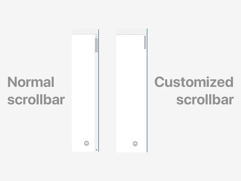
Scrollbar is a small part of the webpage, but from a UI perspective it’s worth customizing. CSS only, no JavaScript.
Standard properties (recommended)
As of Chrome 121+, Firefox 64+, and Edge 121+, the standard scrollbar-color and scrollbar-width properties are the recommended approach.
body {
  scrollbar-width: thin; /* auto | thin | none */
  scrollbar-color: #babac0 #fff; /* thumb-color track-color */
}
These two lines handle most use cases. The trade-off: less granular control than -webkit-scrollbar, but it’s the actual standard.
On macOS and iOS, scrollbars are overlays, so styling changes don’t show much. On Windows, the scrollbar always takes up space, which is where this kind of styling matters for design consistency. Mobile browsers mostly use overlay scrollbars too, so there’s not much surface to style there. -webkit-scrollbar used to be the only practical option, but with the standard properties stabilizing, the current recommendation is to lead with the standard and fall back to webkit pseudo-elements only when you need finer control.
-webkit-scrollbar (legacy)
For more detailed styling (border-radius, borders, etc.), -webkit-scrollbar pseudo-elements are still available in Chromium and Safari.
Important: Since Chrome 121, if both standard properties and
-webkit-scrollbarare present, the standard properties take priority. Use@supportsto separate them.
/* Standard first */
body {
  scrollbar-width: thin;
  scrollbar-color: #babac0 #fff;
}

/* Webkit override only when standard is not supported */
@supports not (scrollbar-width: thin) {
  body::-webkit-scrollbar {
    background-color: #fff;
    width: 16px;
  }

  body::-webkit-scrollbar-track {
    background-color: #fff;
  }

  body::-webkit-scrollbar-thumb {
    background-color: #babac0;
    border-radius: 16px;
    border: 4px solid #fff;
  }

  body::-webkit-scrollbar-button {
    display: none;
  }
}
Pseudo-elements reference
::-webkit-scrollbar              /* entire scrollbar */
::-webkit-scrollbar-button       /* directional buttons */
::-webkit-scrollbar-track        /* space below the scrollbar */
::-webkit-scrollbar-track-piece  /* area not covered by thumb */
::-webkit-scrollbar-thumb        /* draggable scrollbar body */
::-webkit-resizer                /* bottom resizer */
::-webkit-scrollbar-corner       /* bottom corner */
-webkit-scrollbar-button is the up/down arrow button, and it’s usually cleaner to hide it with display: none. track-piece is for styling only the area the thumb doesn’t cover - if you just want to change the background, track is enough. In the fallback block, wrapping it with @supports not (scrollbar-width: thin) means browsers that support the standard will ignore the webkit rules entirely, so you don’t get duplicate styles applied. Things like border-radius and borders aren’t expressible with the standard properties, which is why the webkit pseudo-elements still have a role.
Example
Minimal setup for a macOS-style scrollbar with cross-browser support:
/* Standard */
body {
  scrollbar-width: thin;
  scrollbar-color: #babac0 #fff;
}

/* Webkit fallback */
@supports not (scrollbar-width: thin) {
  body::-webkit-scrollbar {
    background-color: #fff;
    width: 16px;
  }

  body::-webkit-scrollbar-track {
    background-color: #fff;
  }

  body::-webkit-scrollbar-thumb {
    background-color: #babac0;
    border-radius: 16px;
    border: 4px solid #fff;
  }
}
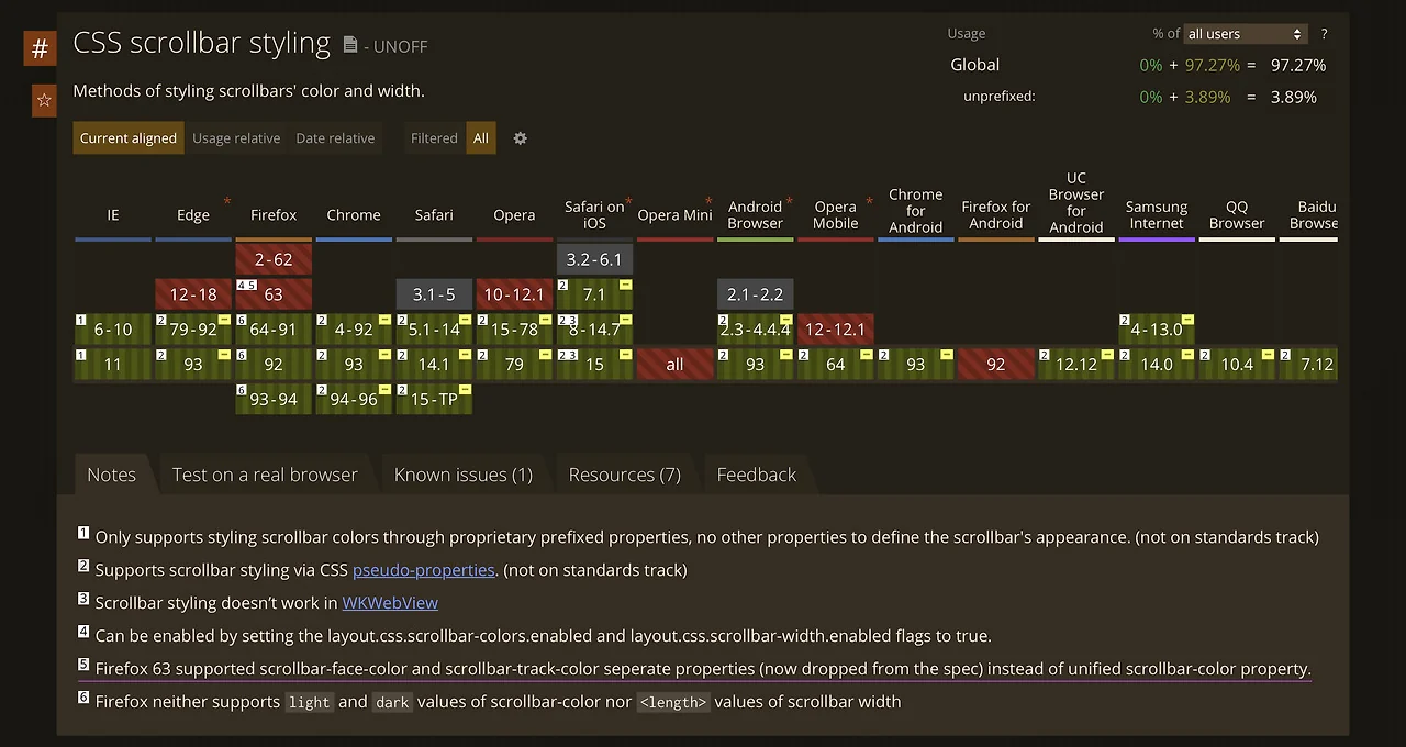
Browser support
scrollbar-color and scrollbar-width are supported in Chrome 121+, Edge 121+, Firefox 64+, and Safari 18.2+. For older browsers, the -webkit-scrollbar pseudo-elements still work as a fallback.
Check caniuse.com for the latest support data.
One thing worth watching is thumb-vs-track contrast. A faint thumb color on a light background makes it hard to tell there’s a scrollbar at all, which hurts accessibility. WCAG 3:1 luminance contrast is a safe baseline. For dark mode, declaring scrollbar-color separately on :root and [data-theme=dark] is the cleanest way to have it flip with the theme.